an engaging online shopping experience is a 24/7 salesperson
When you’re setting up your online shop, filling those product pages with the basics feels like a victory. And it is. But here’s the hard truth — if you stop there, you’re settling for an unconvincing salesperson who fails to make a human connection.
If you want to transform your website into a persuasive salesperson, have fun looking for the ways to connect with your customers. Go further with your copywriting, photos and other visuals. Create a rich experience for potential customers that engages them.
#1: Build intrigue with a description that goes beyond the basics.
Bland product descriptions do very little selling. Are the basics important? Absolutely. But think beyond that too. What can you share that lets people fall in love with your product? This is your chance for rich storytelling.
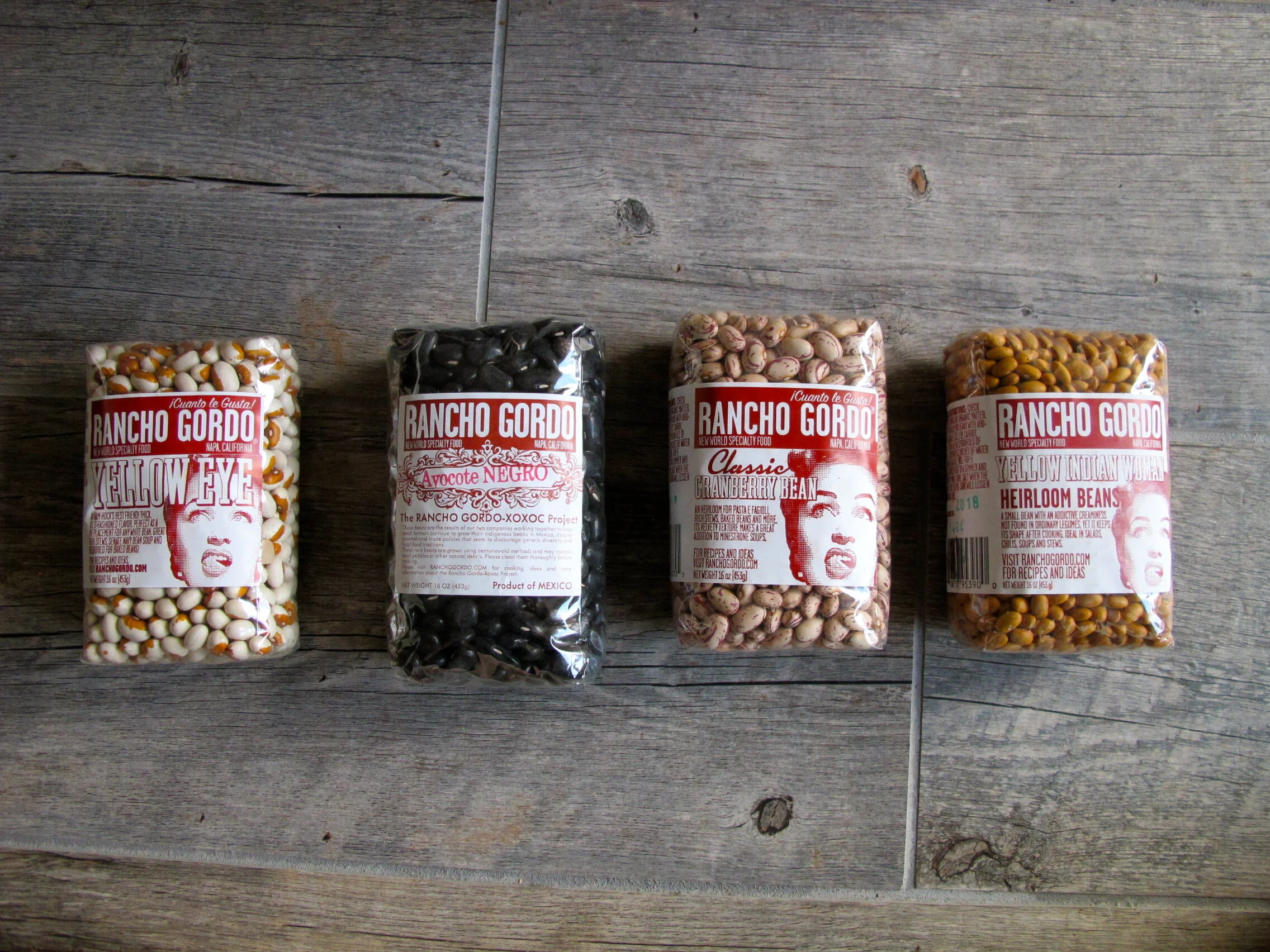
Let’s check out a couple of examples:
Burlap & Barrel -- These aren’t your standard spices. Burlap & Barrel makes that clear by sharing much more than the basics. Each page feels like an invitation to explore. The details entice you to try out new spices.
Rancho Gordo -- Each bean has a story, and Rancho Gordo loves sharing it. They tell you about the origins and nuances of each product — letting you see how distinct each is. It’s hard to pick just one, so you’ll likely end up with a cart full.
When crafting your own description, be sure to check out this related post — Want to craft a product description that sells instead of snoozes?
#2: Enrich the shopping experience by including multiple photo types.
Think about what it’s like to shop in a store. You pick things up, hold them and feel them in your hand. When purchasing online, you can’t quite do that. To sway customers, you need to build a sensory connection in other ways.
Including multiple product shots can help create the experience for them. Include all panels of the package, what’s inside and closeups of the materials/texture. And a bonus -- unlike stores, you can include lifestyle photos. This lets folks see what your product could look like in their life.
Let’s go back to a previous example:

Burlap & Barrel -- They could have left it at a single product shot. That’d be fine and dandy. But that’d also be limiting the storytelling impact. I love that they show:
the product in the packaging (both sizes offered)
the raw product out of the package
the product in multiple suggested uses (prepared meals and beverage)
the farmer (since sourcing is key to their story)
More work? Yep. More impact? You ‘betcha.
Looking for more inspiration? Check out similar approaches from Corky’s Nuts and Bow Hill Blueberries.
#3: Use icons and infographics to communicate visually.
Are potential customers asking questions that you can answer visually? Are there qualities that differentiate your product that you want to give more attention to? Icons and infographics are fantastic ways to communicate or emphasize information.
Let’s see it in action:

Diaspora -- This ain’t your conventional product page, and there’s much to love about that. To answer a common potential customer question -- what size should I get? -- Diaspora has included their Size Guide. And their Equity Pledge explains the price point and shows you how your purchase benefits farmers.

Rishi -- In a very elegant way, Rishi depicts “Preparation” notes. It’s simple, tasteful, helpful.
Goodmylk Co. -- Visual icons establish four main reasons folks ought to choose Goodmylk. This refreshing change in layout keeps you engaged and makes it easier to digest the information.

Ask for help if you need it.
It’s true -- beefing up your product pages takes time, talent and attention. Depending on your business and resources, these approaches may be do-able now or later. Whatever case, you create a richer online shopping experience that becomes your 24/7 salesperson.
If you’re digging in and need help along the way, let’s chat. This is one of many areas I help my clients with, and I’d be glad to set up an arrangement that works for your business and budget.